
Wens Travel Management App
A Mendix web app developed for Wens Travel that allows employees to manage customer bookings and trips. The application helps organize the many components involved in planning travel, while maintaining customer information in one place. Key features include itinerary building, AI-powered functionality and the tracking of the booking process.
Project Details
Client
Wens Travel is a travel agency that specializes in organizing trips for larger groups. Typical customers of theirs could be orchestras who go on tour in Europe, or other travel companies who want to organise battlefield tours (going to various WWI and WWII sites) for groups of elderly from the US.
Problem Statement
To replace Wens Travel’s inefficient mix of Excel and disparate SaaS tools, we developed a centralized application to streamline data management and improve employee productivity.
Role & Responsibilities
I was the lead UX/UI designer and lead Front-End developer on this project. I also performed user research and testing and did some supporting work for the Mendix developers.
Process
Initial
Sketches
The initial project started with collecting requirements and
feedback from the client. I did this together with one of the
other developers so that we could immediately link technical
requirements with the design.
Once these requirements were clear, I started sketching out
some initial ideas for the design of the application. I did this
by hand, as I find that this is the best way for me to quickly
iterate on different ideas and concepts.
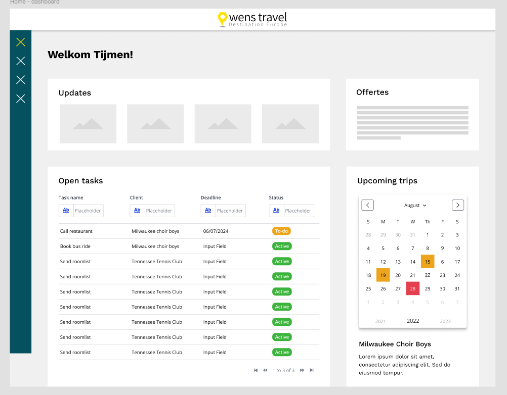
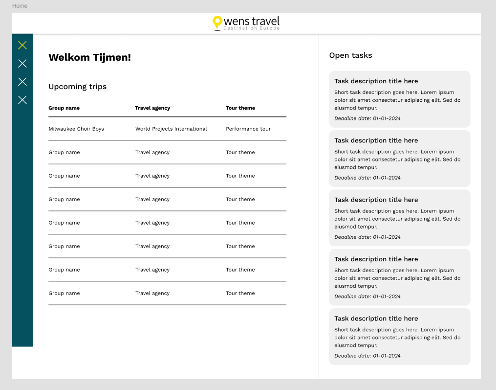
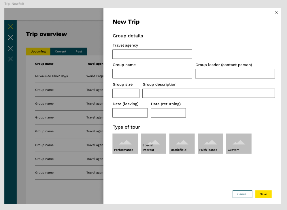
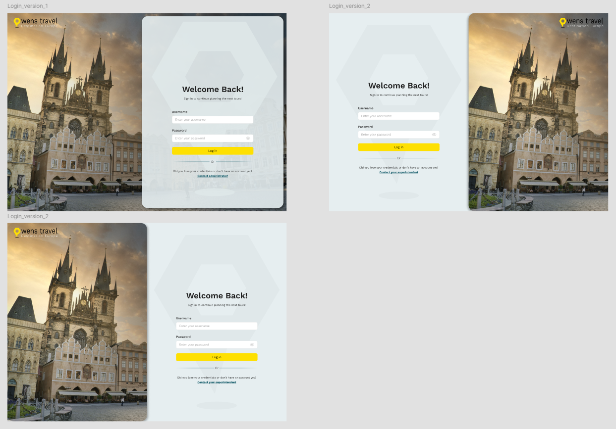
After I had some initial sketches, I created some
mid-fidelity wireframes in Figma to further explore the layout and
structure of the application. I chose to go with slightly higher
fidelity wireframes than I would usually in this phase of a
project, because I estimated that this would make it easier to
communicate my ideas to the client, as they gave a better look at
the final design.
These were then validated with the Product Owner of Wens Travel,
who gave me some feedback and suggestions for improvements.
Overall, the feedback was very positive and I was able to continue
with the next steps of the design process.
Improving the
Design
After an initial round of feedback my colleagues had a rough
estimate of the intended layout of the most important pages. They
then started the development of the application, leaving the
visual (Front-end) finalisation of the pages and design elements
to me. During this phase we worked closely together to ensure the
design was implemented correctly, and to ensure that possible
deviations from the original design would fit within the intended
design.
A complication during this time was that Design and Development
were being done in parallel to one another. This meant that in
some cases the development of a page or section had already
started before the design was fully finalised. This made it a bit
more difficult to make sure that the design and development were
always in sync, and that the design was implemented correctly.
However, we managed to work closely together and communicate
effectively to ensure that the final product met our standards and
the client's expectations.
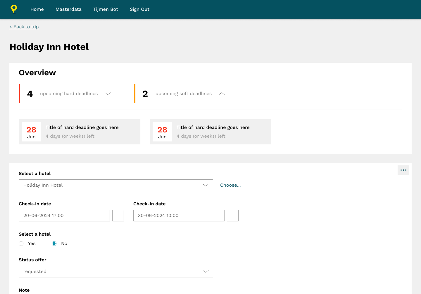
This was my initial idea for the design of the deadlines overview section. I went for a simplistic view at the top, that one could expand into an overview of the deadlines.
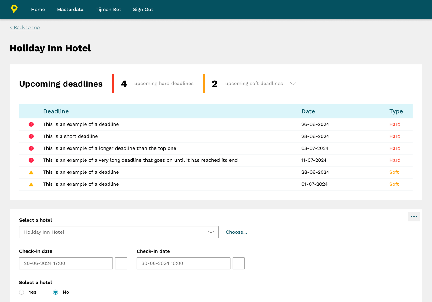
I liked how clear the overview was here, but at the same time it took a lot of vertical space in the screen. This was a problem, because it meant that there was less space for other things. On top of that the right side of the screen had more space, so I went for another iteration.
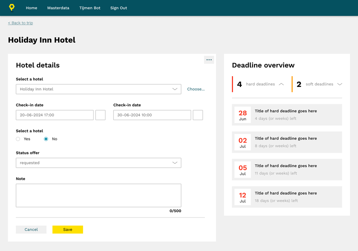
In the end I basically settled for this final version. The final design had some slight changes made to it but largely follows this layout and design.
Validating
Design Choices
& Mobile Design
Throughout the project design choices and assumptions were
validated through feedback sessions and usability testing. These
were done using either the Figma design for things like A/B
testing, or a locally running version of the application to be
more accurate in representing the final product.
Generally, the feedback was very positive, and the client was very
happy with the design choices that were made. However, there were
also some cases where the either the client or various end-users
wanted to change some parts of the design after they had already
been implemented. Usually this wasn't a major issue, as the team
was able to work together to quickly pivot andaddress any concerns
and make the necessary adjustments. However, this was also a major
learning point for myself, to make sure to get everybody onboard
with the design before actually delivering it.
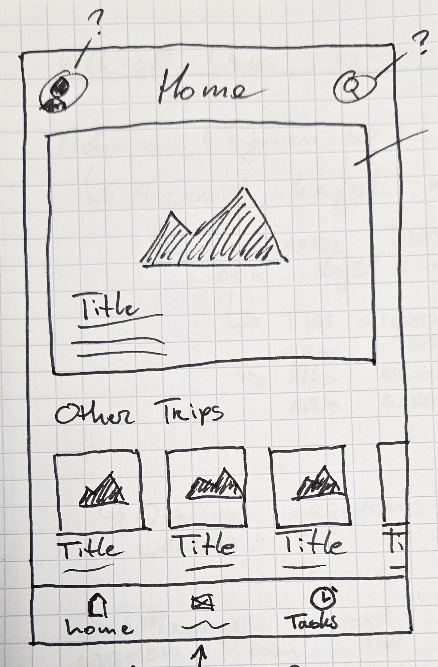
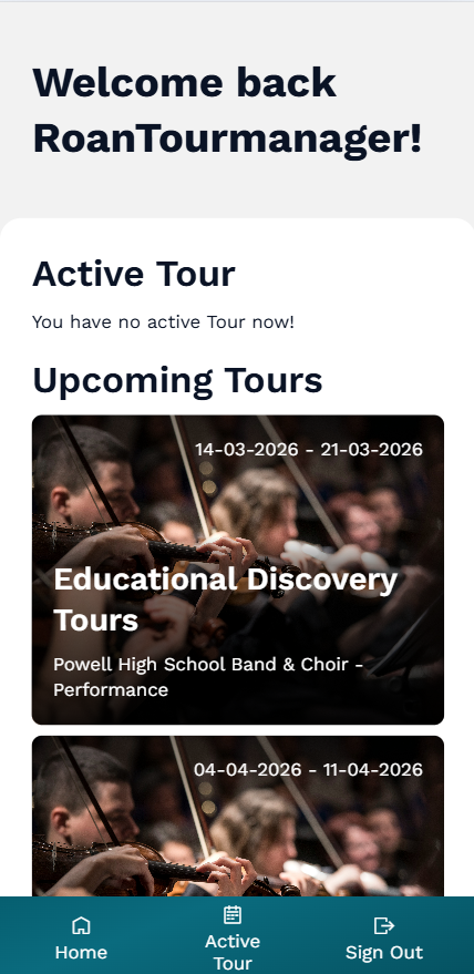
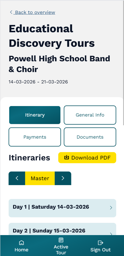
I also ended up making a mobile version of the app, specifically
for tour managers. These were employees or hired workers of Wens
Travel who would go on the trips with the customers, and would
need a way to access the information about the trip and the
customers while they were on the road. I designed this mobile
version based on the feedback and needs of these tour managers.
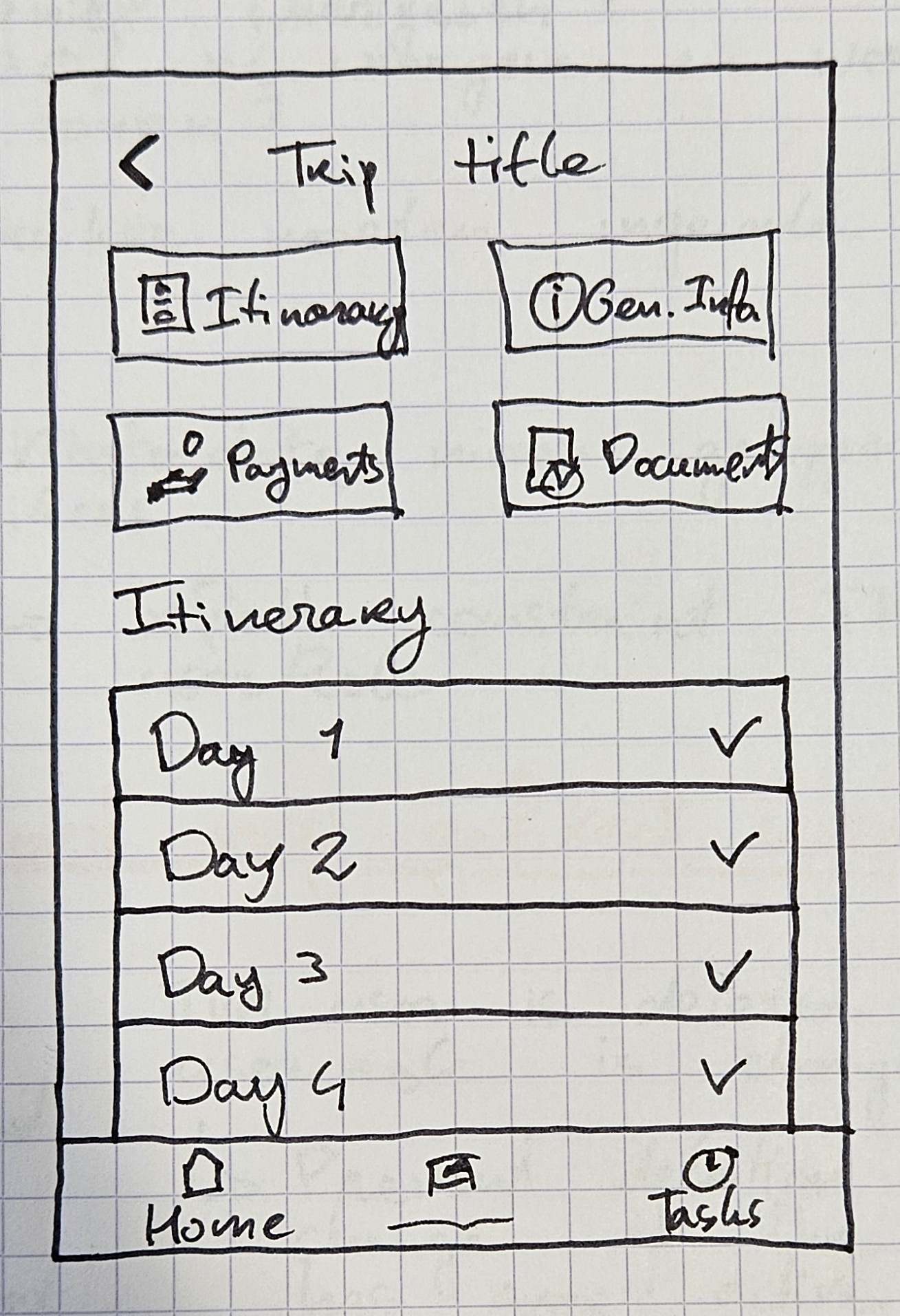
Below, you can see some iterations and how I often go from paper
sketch to a design in a Mendix app. This specific mobile version
did not go through a Figma iteration, as I was working on this
functionality solo. Since most of the design system had already
been established in the desktop version, I had enough information
from my paper sketches.
Final Design
In the end we managed to incorporate most, if not all, of the
client's wishes, and ensured that the end-users (Wens Travel's
employees) were satisfied with the final product. It was amazing
to see them start adopting the new application immediately after
launch. And even though our collaboration with Wens Travel is
ongoing, and they keep coming back with new wishes or requests, it
was great to see the positive impact it had on the employees' work
efficiency.
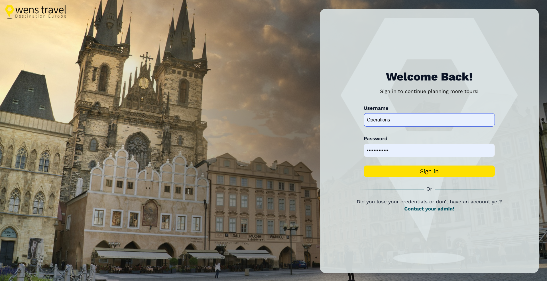
In the final moments of the project I personally had a small bit
of time left, which I then used to add some more visual polish to
the application. I did this by creating a visually pleasing login
screen (as they did not use SSO), adding some low-detail images to
the background of various pages and by adding some visual elements
to the home screen (graphs that give the user some direct visual
information). I think these small touches really helped to elevate
the design and make it feel more complete.
-
Login Screen
-
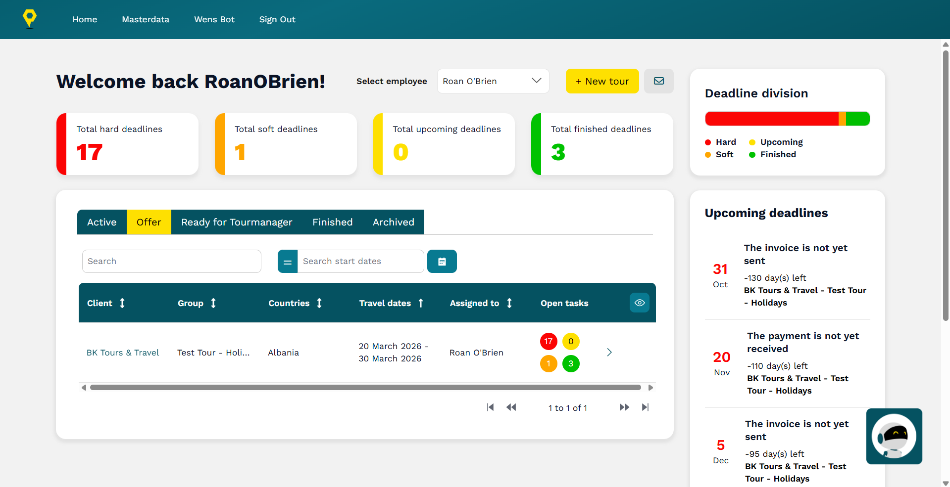
Home Page
-
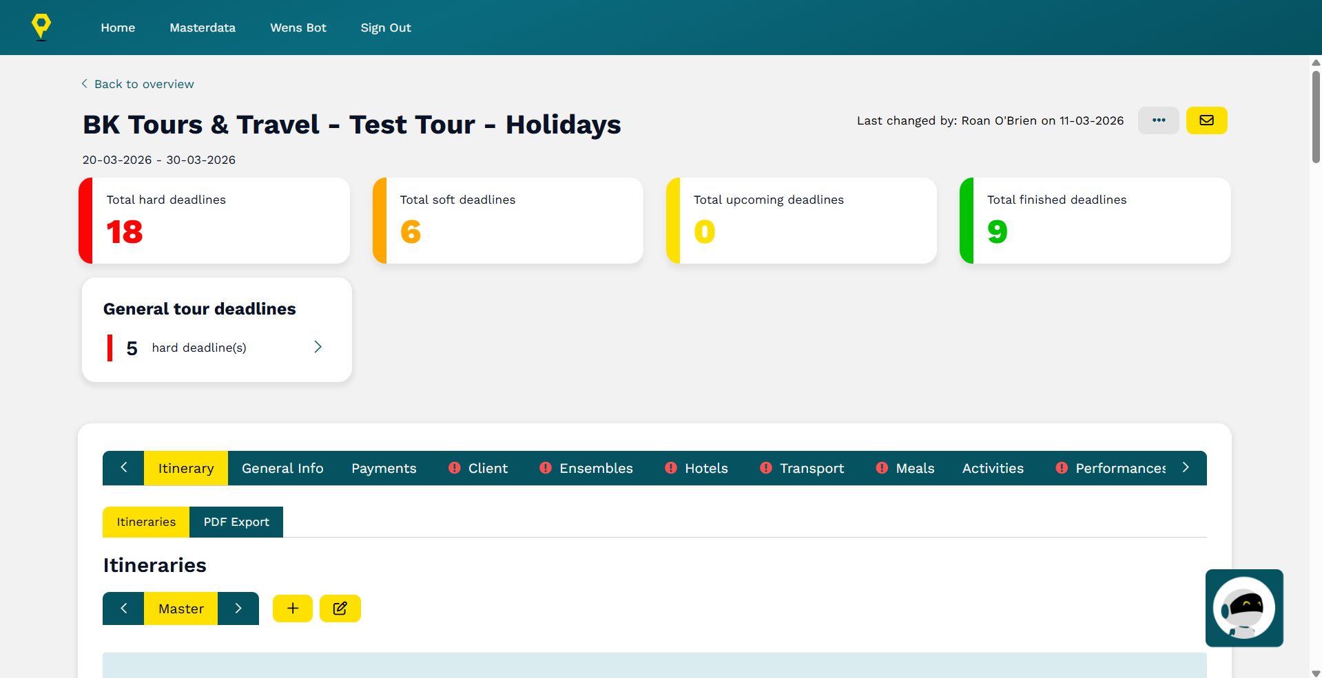
Tour Overview
-
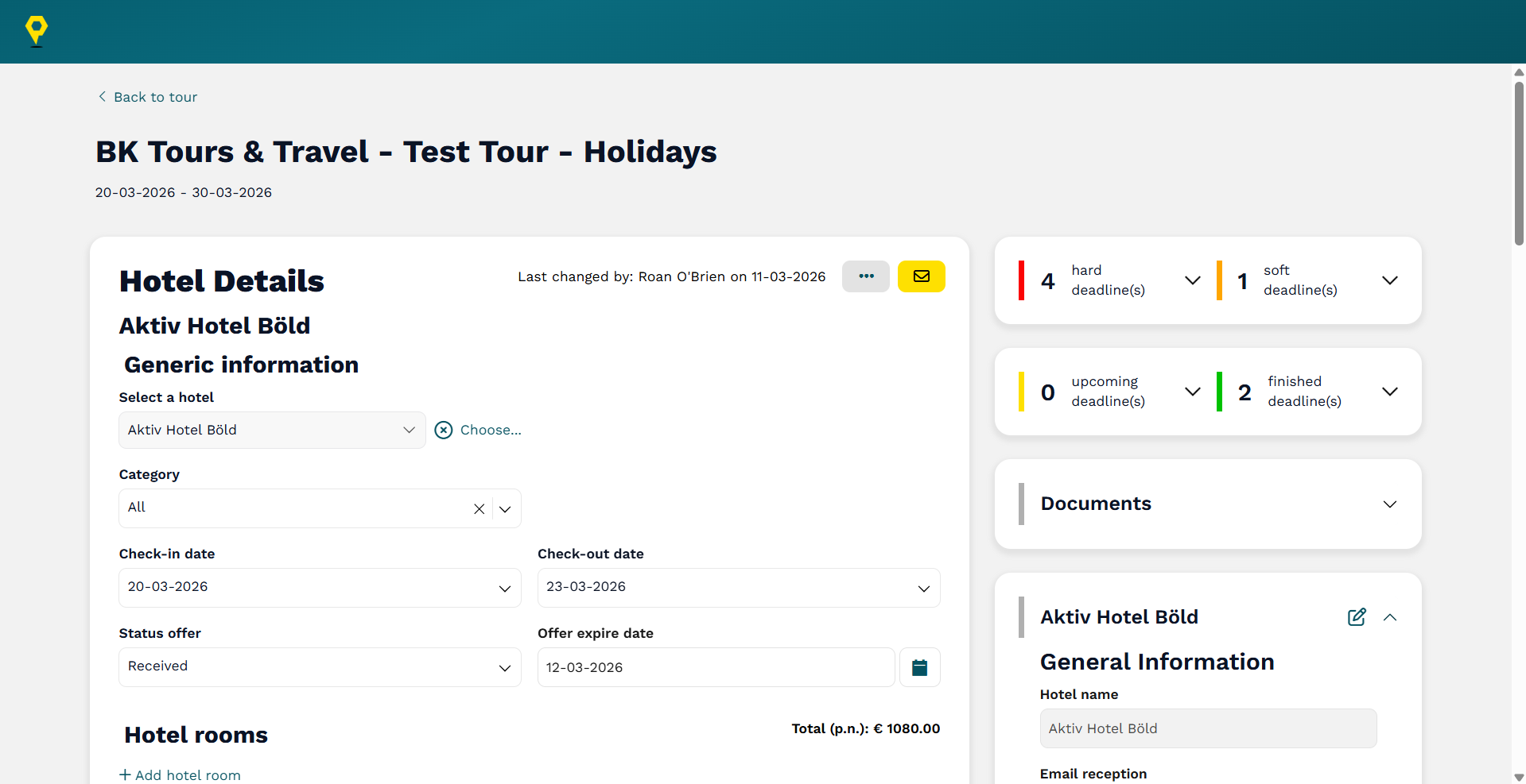
Details Page
Outcomes and lessons learnt
One of the key learnings I got from this project was how important it
is to write down feedback and stakeholder input in a shared document
or user stories. There were multiple instances where the client
provided feedback that either my colleague or I wrote down on paper so
that we could implement it, and then later the client wanted to
backtrack and revert those changes. This created extra work and
confusion, but also taught me the importance of clear documentation.
Of course, the project also taught me a lot about CSS/SASS and Mendix
development, as it was my first real project working with these
technologies. Some specific lessons learnt were were related to having
an organised folder structure for my styling and the importance of
assigning the correct rights to user roles.