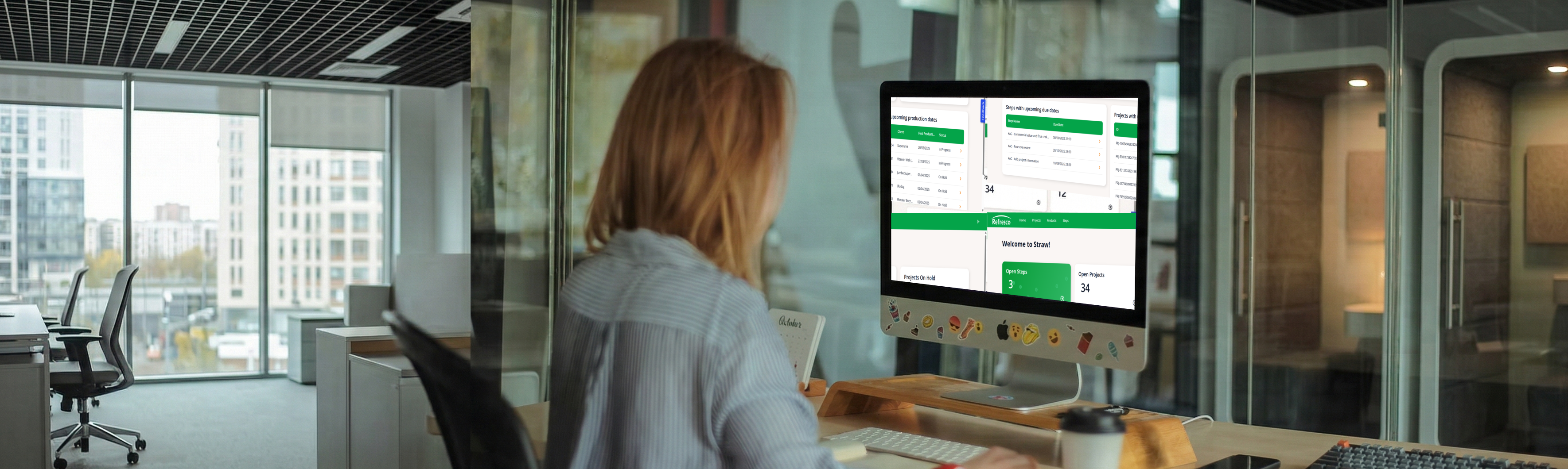
Refresco Benelux process workflow app
A Mendix web app developed for Refresco Benelux using the workflow functionality to allow Refresco employees to complete their projects in a structured way. The application helps organize the many components involved in managing these processes, while maintaining all relevant information in one place.
Project Details
Client
Refresco is a global beverage solutions provider, and this project focused on its Benelux branch, which serves customers from small local brands to large international companies across the Netherlands, Belgium, and Luxembourg.
Problem Statement
Refresco Benelux wanted to replace their slow, inflexible SaaS tool, Refresh, with a custom-built solution with the goal to:
- Manage processes and workflows more efficiently
- Improve structure and data clarity
- Enable easier changes and improvements
Role & Responsibilities
My main role was designing the application’s UI/UX, including user research and testing, while also serving as the lead Front-End developer and supporting Mendix developer.
Process
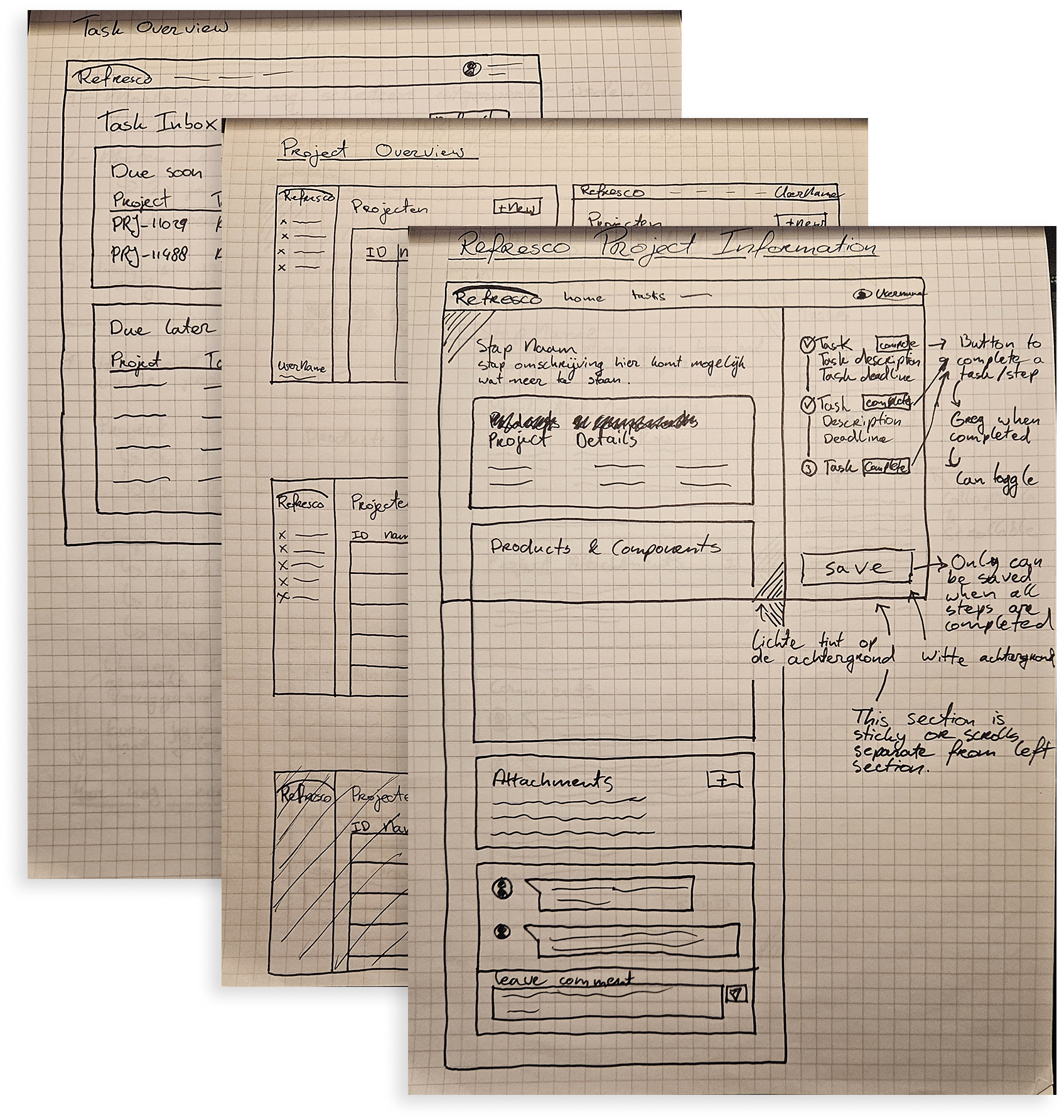
Initial Sketches
& User Research
I started this project in two ways. On one hand I began creating
sketches on paper as I usually like to do. I based these sketches
off of conversations I had with the PO, Jules, and my team of
colleagues. At the same time I also interviewed several key users
of Refresh to find out more about which aspects to keep, and which
to focus on in our endeavours to improve their work experience.
In my sketches I attempted to explore various concepts and
takes on the client's wishes. I often like to annotate my drawings
with notes and potential other ideas. I use them to guide my
exploration and explore things I feel like I can't easily draw.
This could include animations or more complicated interaction
patterns.
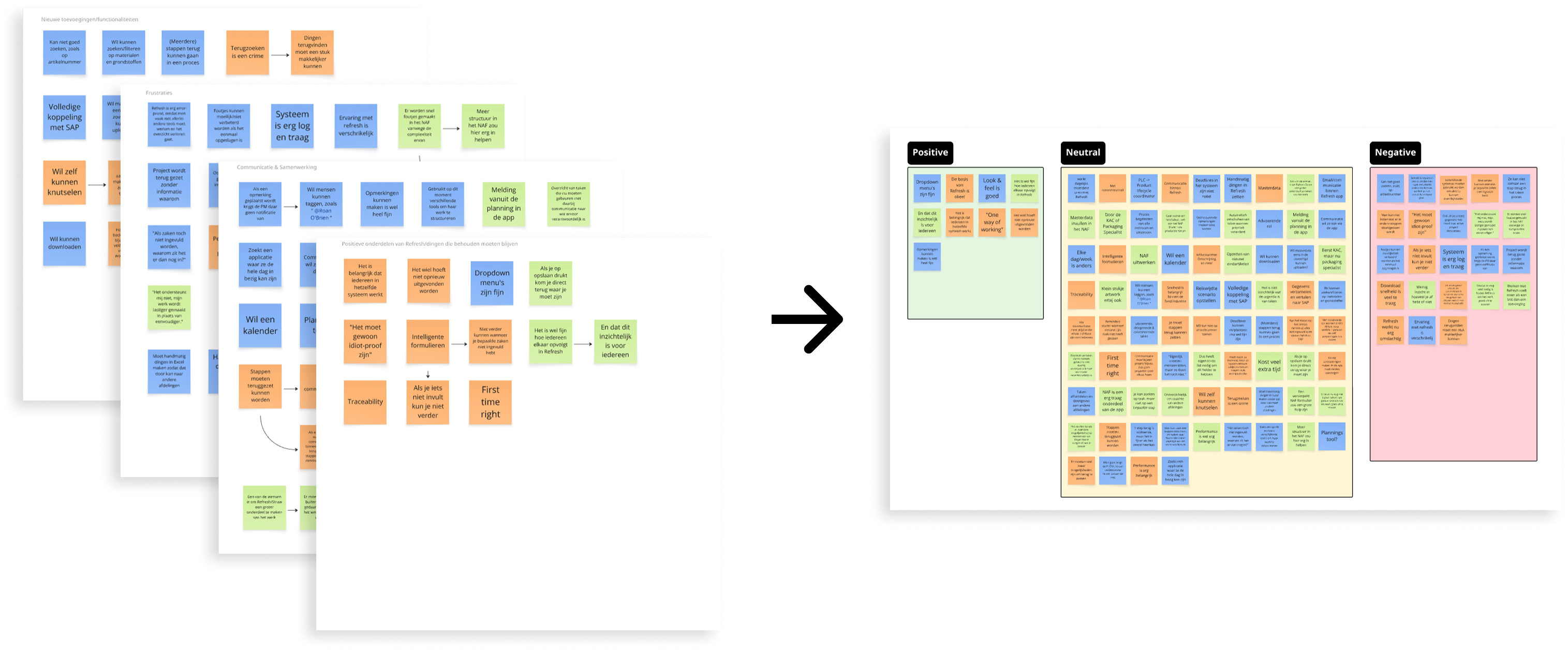
As for the interviews I did, I initially created a list of
questions I wanted to ask, but I also made sure to keep the
conversations open and flexible so that I could explore
interesting topics that came up during the interviews. I recorded
every interview (and later on the user testing as well) as a voice
recording, so that I could easily go back and listen to them again
when I needed to. That way I could also just make sure to focus on
the conversation instead of having to take notes all the time. I
then went back to these recordings and distilled from them all the
parts I found interesting, be they positive or negative. I
collected these in a Miro board and then grouped them into four
different categories: Positives of the current tool (Refresh),
Cummunication & Collaboration, Frustrations and finally Wishes for
new functionalities.
Figma Design
& Mendix Dev
After I felt like I had a good understanding of what the users
needed, I began creating designs in Figma. Here, I stuck mostly to
low-fidelity wireframes, because I knew the developers I was
working with were already ahead of me. They used the wireframes as
a starting point for development, and I continued within Mendix to
finish the design there. I kept a close connection with the
development team and the PO throughout the process to ensure the
design remained aligned with the user needs and the client's
expectations.
In the end I ended up not using Figma as much as I had expected,
because the developers were already working on the technical
implementation in Mendix while I was still creating the
wireframes. This meant that I had to switch to working in Mendix a
lot sooner than I had expected, which meant that I had to learn
how to design within Mendix much faster than I had anticipated.
Besides Front-End development and SASS coding within Mendix I also
worked on several Mendix backend functionalities. One of which was
a way of leaving feedback on a step in a process, which would be
sent back to the previous person in the chain for improvements.
This was more complicated than we had anticipated as a team,
because in Mendix Workflow, even if you seem to be going back a
step, the system treats it as a new instance of that step. That
meant that the user would have to give feedback on a step that
technically did not exist yet. It took a while but we eventually
found a way around it.
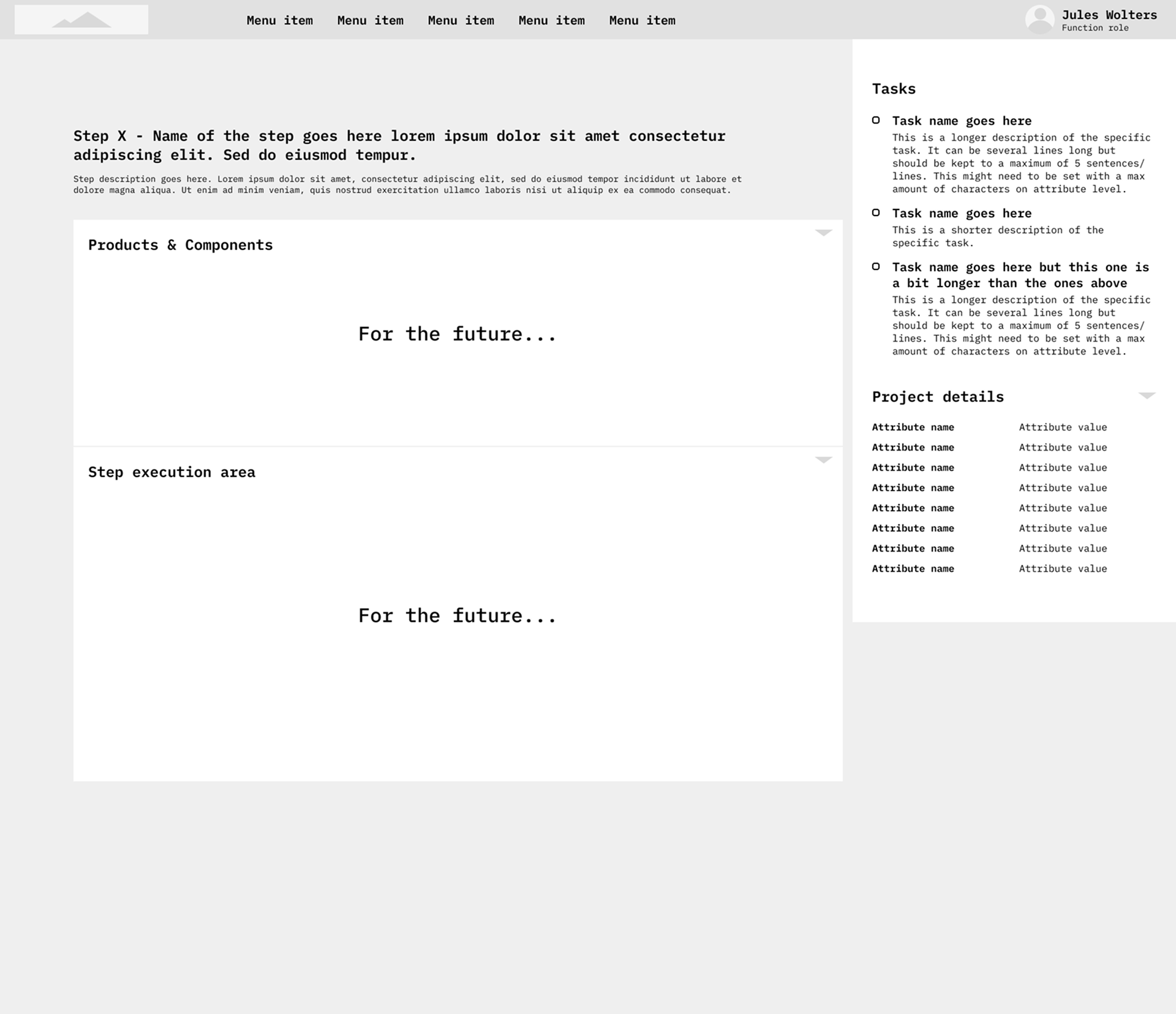
As one can see these wireframes are very low-fidelity, and they were mostly meant to give the developers a general idea of the structure of the application and the various components that needed to be developed.
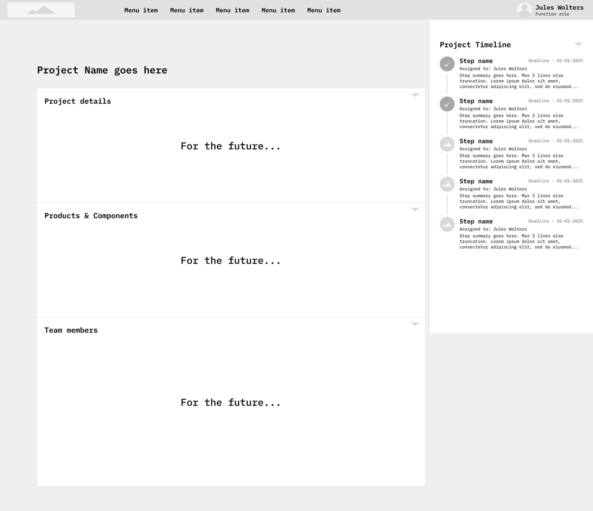
I used these wireframes to iterate on various ideas, such as the timeline component that can be seen on the two wireframes on the right hand side of the screen.
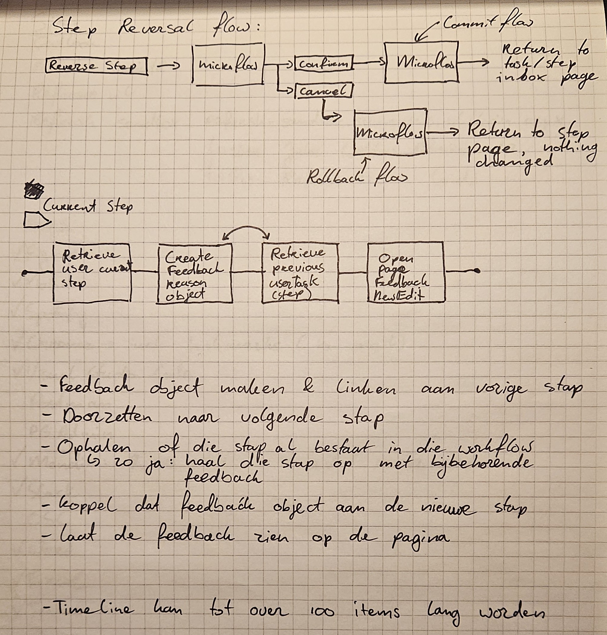
When microflows in Mendix get too complicated I like to draw them out. This allows me to look at the problem in a more abstract way, and not focus on the direct limitations of development. It also allows me to more easily iterate on various solutions before going back to mendix to try to implement it.
User
Research
Once we had a version of the app that was far along enough that I
could sit down with users to test the functionality I made a test
script. I then sat down with various users from various
departments to gather feedback. I went about this very much in a
similar way to how I did the User Research as I described above. A
key difference being that I gave the users a set of tasks to
complete within the app, and then I asked them to think out loud
while doing so. This allowed me to get a better understanding of
their thought process and how they were using the app, which in
turn allowed me to gather more useful feedback and ask specific
questions regarding their experience.
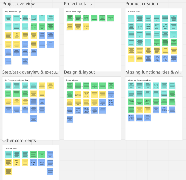
Again, I sorted the feedback into various categories based on
functionalities and pages within the app. The various colours used
for the sticky notes were linked to the people I interviewed, so
that I had a clear overview of the different perspectives and
needs, and could easily ask any one of them for clarification.
Doing it this way gave me and the team a much better understanding
of which parts of the app to improve upon more, and which were
already getting good feedback.
Final Design
After iterating on the app using the feedback from user testing, I
was able to refine the design and address the main pain points. In
the end we delivered a product that met the client's needs and
provided a good user experience. Most, if not all of the users'
original pain points were addressed.
I added a nice login screen that the PO was very impressed with.
In my spare time I added some bubbles as I thought it fit the
industry and vibe of the company. Jules (the PO) was pleasantly
surprised by this addition, which was a nice bonus, after which I
decided to also add these bubbles to the "Open Steps" card on the
main landing page.
Overall, I am very happy with how the design turned out, and I
think it is a big improvement over the previous solution
(Refresh). The feedback from users in the end was very positive,
and they were very happy with the improvements that were made. The
client was also very happy with the final product. I am proud of
how we managed to present the large amounts of data in a much more
structured and clear way, while also making it more visually
appealing and easier to use.
-
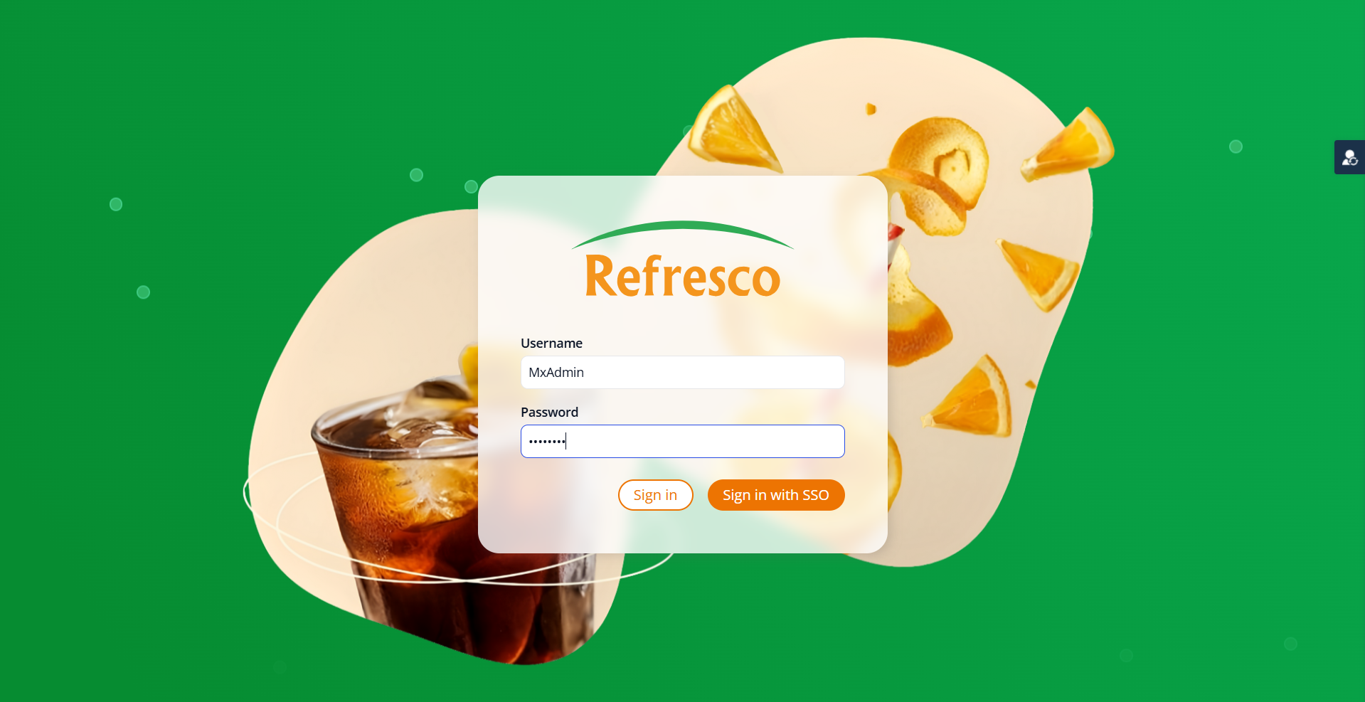
Login Screen
-
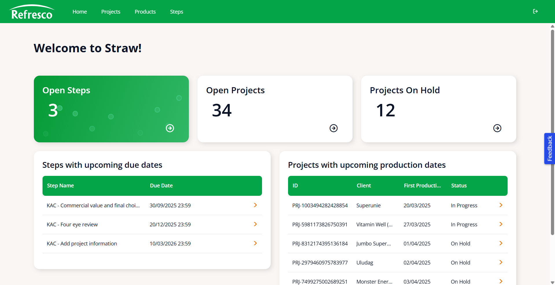
Home Page
-
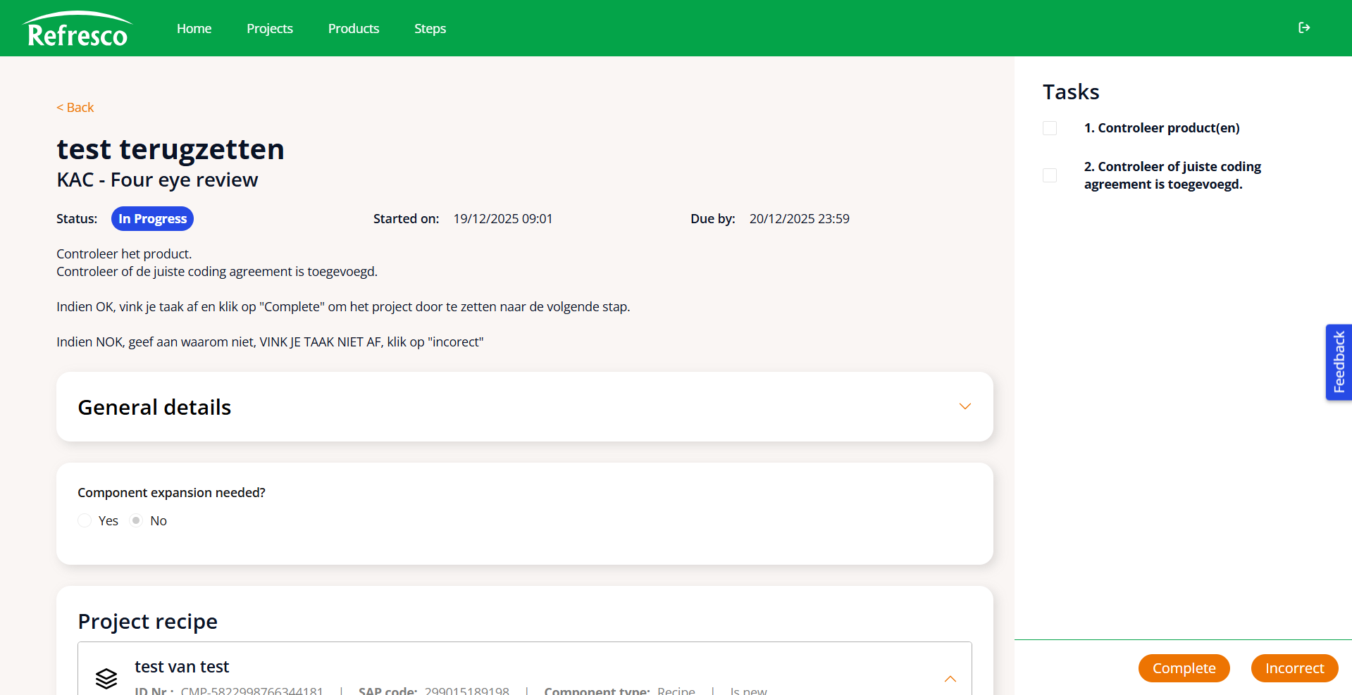
Workflow Step
-
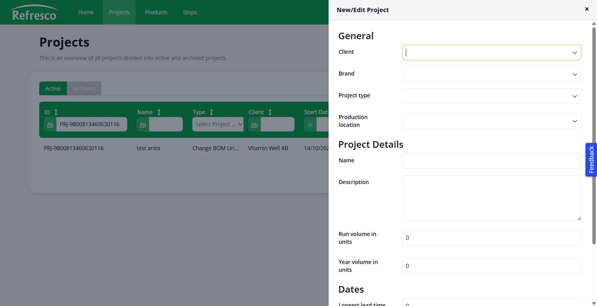
New Project
Outcomes and lessons learnt
An important part of this project was getting the users onboard. This
meant that I had to involve them early on during the development
process. I think I did this pretty well, to a certain extent. However,
in hindsight, I think I could have done this even better. Most
importantly I could have done a better job at communicating with the
users throughout the project. At various points during during the
project I lost myself a bit in my own work and forgot to keep the
users in the loop. Though this did not cause any major issues, I think
it could have been prevented and would have made the process smoother
if I had kept the users more in the loop.
On top of that I realised a bit too late that I also needed to be a
bit clearer in what the PO could expect from me during the development
process. As he had zero experience with digital product development,
and thus did not know what a UX designer does, I had to explain my
role and the development process more clearly. While this eventually
became clear to him, I think I should have presented myself more
actively in the beginning stages of the project and taken him along on
one or two creative sessions to show him both the process of designing
as well as what else I could do for him.
Finally, one of the major hurdles for me in this project was the speed
at which my colleague developers were working. They were already
working on the development of the app while I was still creating
wireframes in Figma. This meant that I had to switch to designing
within Mendix much sooner than I had expected, which meant that it was
harder to first validate my designs before implementing them. At
first, this was a bit of a struggle for me. However, I think in the
end I managed to keep communication betwee me and my colleagues
smooth. It also forced me to learn how to design within Mendix much
faster than I had anticipated, which is a skill that I am very happy
to have now.