EchtFit website
A marketing website for Echtfit, a fitness app that helps users track their workouts and progress with the help of an AI-powered fitness and dietary coach. The goal of the project was to create avisually appealing website with an "Apple-like" design.
Project Details
Client
The client of this project was EchtFit, a fitness app that aimed to revolutionise the formula by providing an always present, AI-powered fitness coach and dietician.
Problem Statement
The previous basic WordPress site lacked the impact to sell EchtFit effectively, prompting a redesign with custom visuals, animations, and layouts to better showcase the app’s value to fitness enthusiasts.
Role & Responsibilities
While another designer handled the EchtFit apps, I independently transformed the client’s basic wireframes into a high-impact website with an "Apple-like" wow effect.
Process
Initial
Sketches
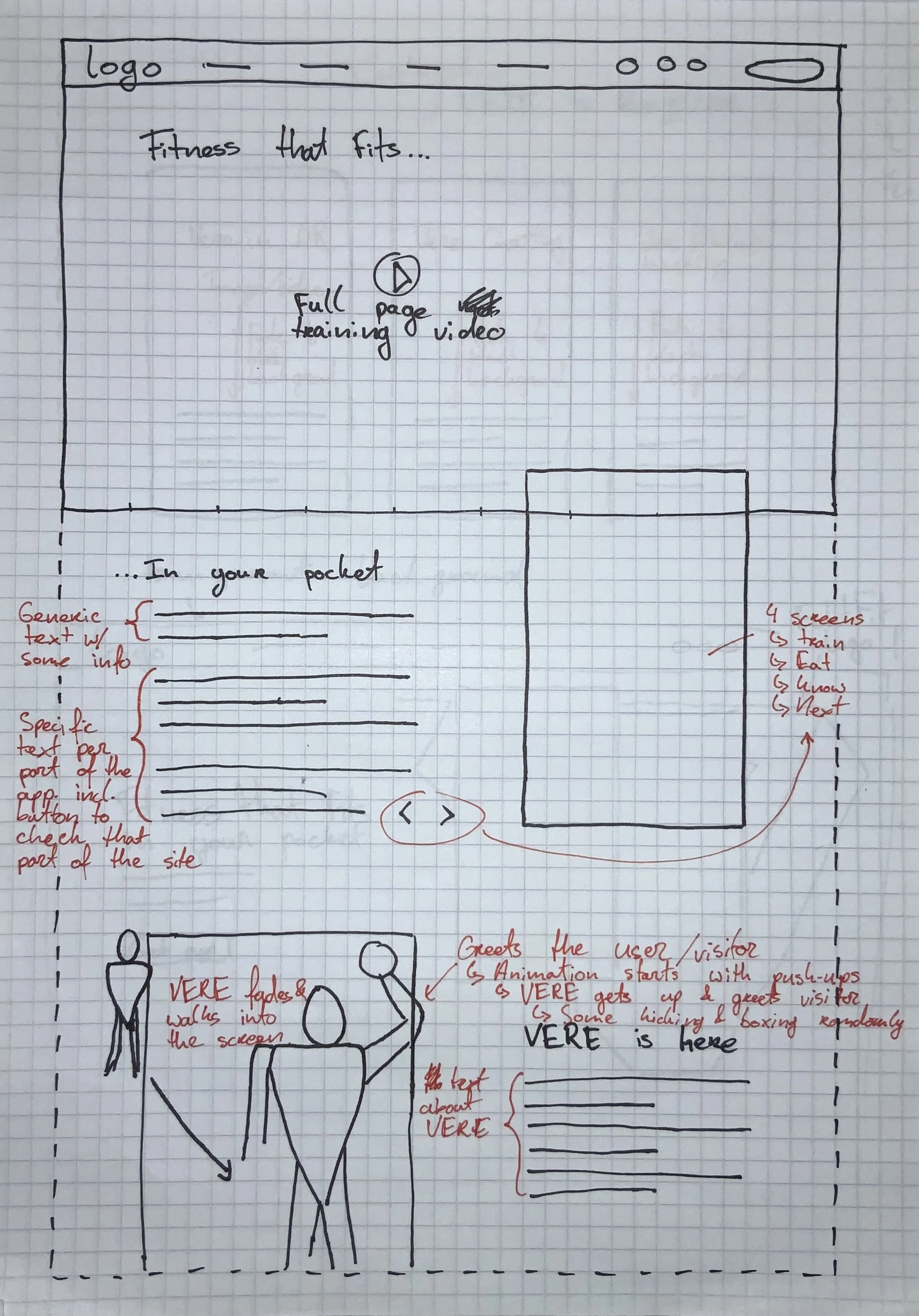
The client had provided a simple overview with a suggested
wireframe, covering the type of content they would like to show
and most of the copy they wanted to have on the website. Their
request to me was to take these wireframes, see what I wanted to
keep from it and where I thought I could improve it, and see what
kinds of visual elements and animations I could think of to give
the whole website a premium “Apple-like” experience. This set the
bar quite high for me and I started scouring the internet for
inspiration and ideas.
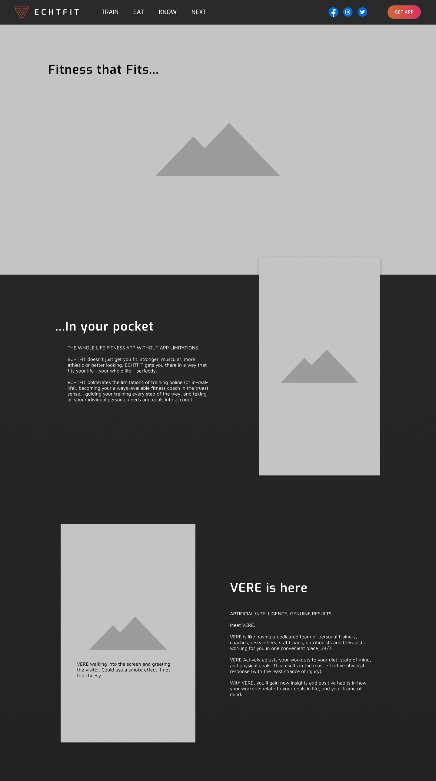
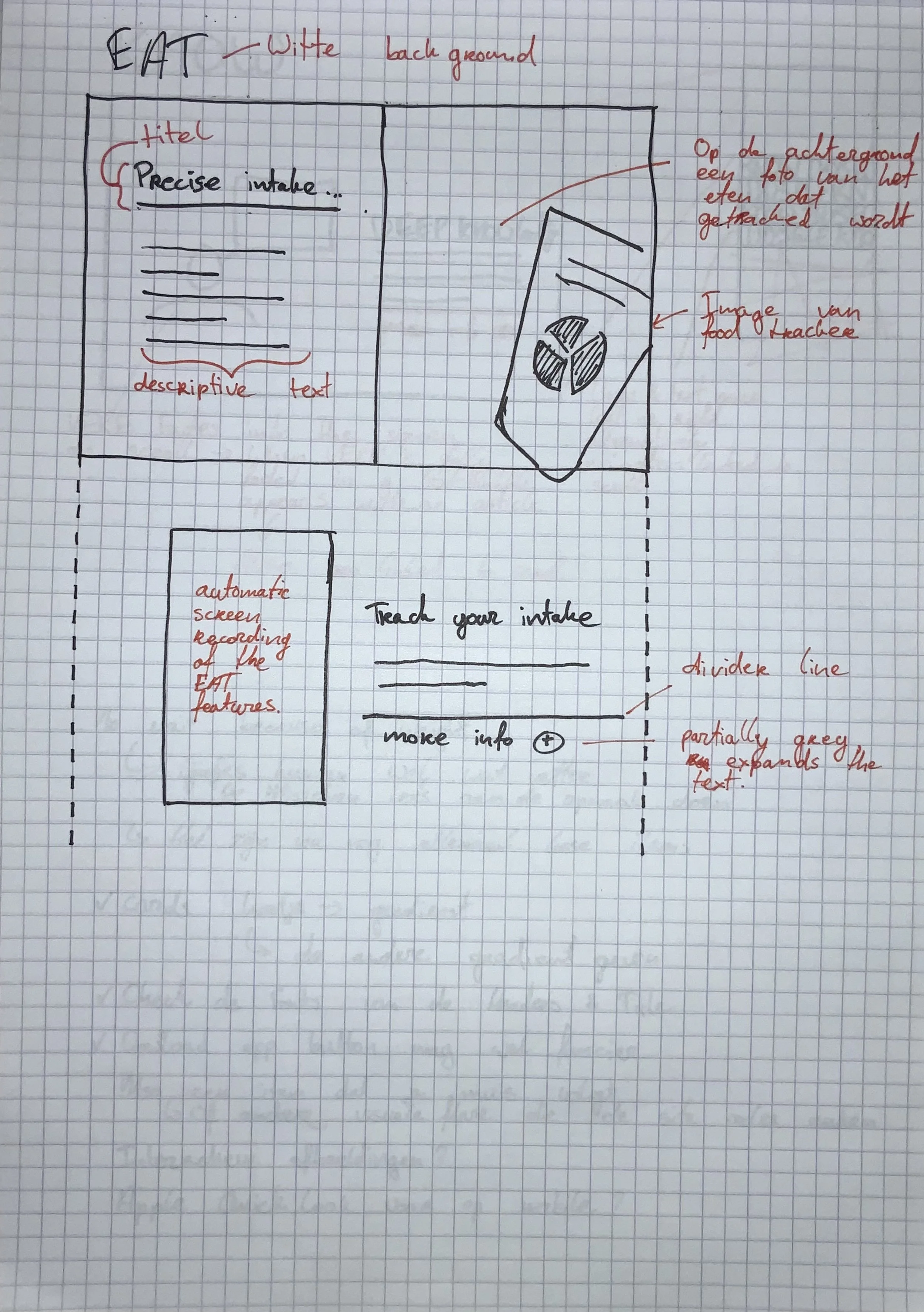
These ideas were then used as a basis for my first sketches.
I began partially digital in Figma, and partially on paper, using
paper mostly for things I wanted to get a quick feel for and using
Figma to be able to see how it would actually work on a screen.
Improving the
Design
After getting some feedback from my colleagues I went back to my
designs to increase the fidelity. My goal was to make the mockup &
prototype look and feel as much like the final product as
possible, so that the client would have a good idea of the
direction I was headed in.
To do this I created small animation prototypes in Figma and where
necessary, I annotated the designs with text to explain my vision.
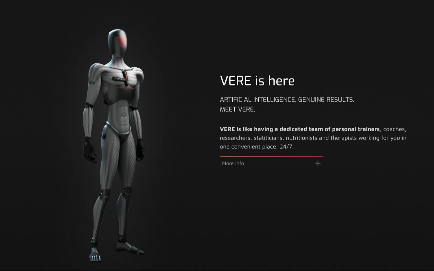
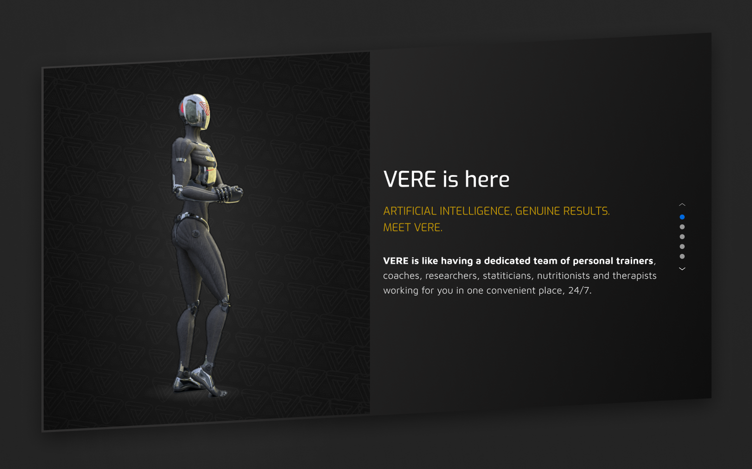
I struggled quite a bit with the “VERE is here” section, as I had
to show quite a lot of information, without it getting boring or
visually uninteresting. The section was meant to act as an
introduction to the AI named VERE, and also give an overview of
all the things VERE would help with. However, because this was
quite a lot of information I wanted to avoid it being a simple,
fairly long list. Eventually I solved this by creating a card-like
element where the viewer could quickly scroll past the section if
they wanted to continue on to the rest of the website, or click
through the content for more in-depth information about VERE.
My goal for this project was to design and deliver a site that would blow both the client and their future customers off of their feet. To do this I wanted to lean a lot into using interesting animations and ways to display information. I had a lot of creative freedom, but I did have to take the planning of the project into account, as well as various technical limitations.
My goal for this project was to design and deliver a site that would blow both the client and their future customers off of their feet. To do this I wanted to lean a lot into using interesting animations and ways to display information. I had a lot of creative freedom, but I did have to take the planning of the project into account, as well as various technical limitations.
My goal for this project was to design and deliver a site that would blow both the client and their future customers off of their feet. To do this I wanted to lean a lot into using interesting animations and ways to display information. I had a lot of creative freedom, but I did have to take the planning of the project into account, as well as various technical limitations.
Adding more
Visual Flair
Once the main structure and layout were mostly set, I began
continued adding extra polish and eye candy. I did this by
creating sections with interesting animations and making sure the
page had enough visual variety. One of these sections was about
EAT in the app. I wanted to really show the process of how food
can be tracked in the EAT section, and how easy it is. To do this
I created a small walkthrough, which the viewer scrolls through,
adding small tooltips to highlight specific parts. This section
was greatly praised by the client.
I also added some variety by adding some sections with full-width
images on the background, and the front-end developer came up with
the idea to use a parallax effect on images and text that lay over
these background images to give it a bit of a 3D effect.
Final Design
In the final design, some changes were made compared to what I had
made, but overall both the main structure, as well as the most
important parts were kept mostly the same. The reason for this
change was a last-minute change on the client's side, while I had
already continued to a different project. Because of that, I did
not have enough time to also keep making changes to the design of
this website, and the front-end developer implemented the changes
as he thought would be best.
The choice was made to add more videos, which I believe adds to
the flashiness of the site. The intro video for example definitely
works well as an eye-catcher and functions as a good intro to the
product. The choice was made deliberately to add many animations
and videos, knowing that it would make the site run less well on
older and less powerful devices/browsers, but overall I am very
happy with how our front-end developer implemented my design. I
feel like my goal of creating a flashy, premium experience was
definitely met.
Outcomes and lessons learnt
This was the first big project I worked on mostly as the only designer
at YipYip, previous projects were all done along with another
designer. So here I had a lot more autonomy and pressure on me to
deliver. On top of that, the client requested an Apple-like
experience, which added to the pressure on me. However, this also give
me the opportunity to let my imagination go wild and try to come up
with cool ideas to showcase the Echtfit brand and all of the
information they wanted to bring across to their customers and
potential investors.
Something I definitely learned during this project, was that it is
incredibly important to pick your battles when communicating with a
client. What I mean by this, is that it is essential to keep asking
yourself “Is it really worth it to come up with a different solution
to what the client wants because my expert opinion thinks so? Or would
it be better just to do what they want and let them find out
afterwards what's better?”. This happened a couple of times, where the
client had some wild idea that seemed cool on paper, but wasn't a
practical solution to the problem they had. An example of that is the
final video that they decide to use for the "VERE is here” section.
Adding loads of after-images makes the whole section feel incredibly
messy and confusing, without adding to the narrative or branding.
However, since it took some time to make it, and since the client
really liked it, our team at YipYip decide to just implement it the
way they wanted and be done with it. In the end, we are of course
hired to create what the client wants, and if they don’t want to
listen to our advice then that's also a valid way to go.
Something else I learned was that it is vital to communicate clearly
with a client how and what type of feedback you would like to receive.
This is especially the case when handling international clients that
are used to different cultures and therefore working environments.
During this project, I often received very positive feedback, which
was followed a couple of weeks later by the client wanting to change
it after all. If I had communicated to the client what type of
feedback I was looking for, maybe we could have prevented this and
that way saved some time in the process.